Beth Alvarez - Author of Epic Fantasy
  • Patience (Among other virtues I lack)

    My mother used to joke about changing her legal middle name to Patience. We always thought it was a great idea. I mean, the woman had seven kids! How could patience not be her middle name?

    Unfortunately for me, I take after Dad.

    Dad is an accomplished businessman, the kind of man that makes things happen. When he says jump, you better believe people will be jumping. When he says he expects results, he gets them and gets them fast. It’s that kind of weighted expectation that makes things happen in the corporate world, and it’s one of many reasons he’s a successful professional.
    The thing is, while those sort of high expectations for immediate results work great in business when you’re the boss, they work a little less in personal, day-to-day life.

    Much to the dismay of just about everybody, there’s no such thing as instant results. And while I realize and recognize that, I still find myself getting frustrated or impatient when  things don’t instantaneously come together. This is one of the reasons that, while I love doing it, I don’t often work with oil paints.

    That, and because I can’t get the caps off any other colors.

    It’s hard to wait for things to come to fruition. Worth it, but hard, and waiting often ends with me feeling guilty over my Veruca Salt I want it now mentality. There’s lots of things I want, of course.
    I want more time to write so I can finish the multiple books I’m working on.
    I want the editing of Serpent’s Tears to be done so I can start querying.
    I want a big house in the country.
    I want a spotlessly clean and perfectly painted home.
    I want, I want, I want.

    This, of course, is one of the things I’m working on as 2014 blossoms. I want these things, but they aren’t urgent necessities. I’m not unhappy without them and there’s no guarantee I’d be happier if I had them. It’s tough to temper wants, but until I develop my mother’s saintly patience (if I ever do) it’s the best I can accomplish.

    I’ll have it all done eventually, I have long lists of things to do to keep me on track and get me there. The hard part now is keeping my eyes on the list rather than the end result, because it’s important not to lose sight of what I’m doing in favor of pining after why I’m doing it in the first place. And really, my motives aren’t as selfish as they seem in my head when I let how much I want get in the way.

    I want to finish these books so I can share the stories I have to tell with others.
    I want a clean and beautiful house so I can have more time to spend with my family instead of spending so much time cleaning and working to try and make it comfortable.
    I want a big house in the country so I can watch our little girl run and play in the yard with the dog, without worrying about it happening in a crime-laden city. And also so I can walk through a not-so-tiny living room without stubbing my toes on baby toys. Okay, so that part’s a little selfish, but hey, I can dream.

  • To talk of many things

    I often find myself looking at my weekly to-do list and trying to figure out what I should write for my blog. I’m sure without context, that makes no sense at all, but I’m a very list-oriented person, you see. I keep a to-do list that breaks down everything I need to do in a typical week, including remembering to eat breakfast and lunch. Partially because I have a hard time remembering to do those things, partially because they’re easy to do and it feels great to start your day with marking off the very first thing on your to-do list!

    Writing something for my blog is on the list for Monday, Wednesday and Friday, even though I only update my blog once a week. Sometimes I’m able to knock out a whole blog post in an afternoon and then I mark it off for the other two days of the week. Other times it takes me all three days to put something together, since I have to fit my blog writing in around the schedule of a very small, very busy person who doesn’t like to take naps.
    And sometimes it’s just because I can’t think of anything to write about.

    I never have a lack of things to talk about, which means my problem is largely self-inflicted. I have this strange idea of hyper-organizing everything in my life (which never works, mind you) and that even includes things like internet activity. Writing commentary goes here, general chatter goes on Facebook, brainstorming and projects go on Pinterest, daily writing word count updates go on Twitter… you get the idea.

    And because I’m so intent on organizing everything, I always end up operating with the notion that those streams of activity shouldn’t cross. Ever!  I mean, you know what happens when you cross the streams, right?

    Except that’s not true. At least, not in this case. There’s nothing wrong with a little overlap. In this situation, it might even help.
    See, I’ve been trying to blog weekly for a whole year now. Crazy how fast it went by. I missed a few updates, but on the whole, I did pretty good. I feel like weekly blogging is important for me to do, for pretty simple reasons. I’m a writer, after all, and as soon as I stop writing, I stop being a writer. Right? At least, I think that’s how that works! It doesn’t really matter what I write about, just that I do it. And that’s something I’ve decided to try to focus on a little more in 2014. It doesn’t always have to be talking about writing. So like the Walrus said, the time has come!

    “The time has come,” the Walrus said,
    “To talk of many things:
    Of shoes—and ships—and sealing-wax—
    Of cabbages—and kings—
    And why the sea is boiling hot—
    And whether pigs have wings.”

    Somewhat unrelated, as a child, when my great-grandmother read to me, I always thought she was saying ceiling wax. I never could figure out what that was supposed to mean. And who would bother to wax their ceiling, anyway?

    In any case, waxed ceilings or not, that’s a great example of the sort of things I probably could be writing about, instead of trying to dedicate myself to blogging about writing 100% of the time.

    It might sound weird, but I’m trying to become a little less organized about being organized, even though another goal for 2014 is to get everything in my life nicely organized. I know, it probably hurts to even read that sentence. But I promise, it makes sense in my head.

    I think.

  • Friday Photo Break, vol. 52

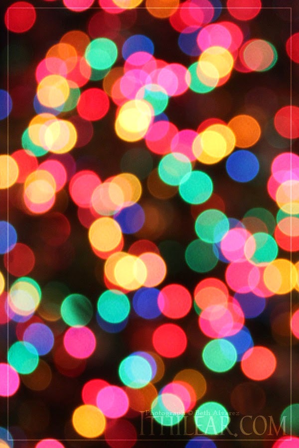
    Finishing the year of photos with bokeh. I’ve always loved the way the lights on a Christmas tree look when you squint. Putting the camera out of focus to capture it for the year to come was a spur-of-the-moment idea, but I’m happy that I did.
    I hope you’ve enjoyed this year of weekly photos! Once I’ve had time to settle my schedule, maybe I’ll do it again.

  • Cover Yourself! A Quick Guide to Making Your Own Book Covers

    The cover of a book is probably the only place my education as a visual arts major is useful in my chosen career path. The cover of a book can make a world of difference in its success, especially for eBooks.

    Hiring a designer can be pricey, but the good news is you can do it yourself and have excellent results. Having the right tools is helpful, but not a necessity. If you don’t have access to high-end graphics software like Photoshop, you can still get pleasing results with free programs like Gimp, it might just take more time. Regardless of the program you use, though, there’s a few important things to consider when designing your own cover.

    Work big.
    This is a rule all artists should follow, whether working on paper or digitally. If you’re making an eBook cover, you’ll want to create an image that’s at least 1600 by 2400 pixels in size, but bigger is better. Remember that if you’re using the same cover for a print edition, you’ll need it to be even larger than that, and a minimum of 300 dpi (dots per inch) resolution. You can always shrink an image if you need to, but unless you’re working with vector-based art (If you don’t know what that is, it’s safe to assume you’re not) you won’t be able to make it bigger without some ugly side effects.

    When using fonts, only use one of each.

    This is a rule I learned in a graphic design class. Rules can be broken, but this is a great starting point if you’re unfamiliar with making design elements work together.
    Generally speaking, there are three types of font you’ll use on a book cover: Serif, sans-serif, and script. Rather than using multiple script fonts on a cover, try using one font in varied sizes to add visual interest without overwhelming the senses with too many typefaces.
    It’s also important to make sure you look up the usage rules for each font you plan to use. Even some of the fonts that come with your computer are not licensed for commercial use! If you’re in need of fonts that are free for commercial use, check out FontSquirrel. Each font’s license is given in the form of handy bold or greyed-out icons telling you if it’s okay to use it for web, mobile, books and other forms of media.

    Be sure any images you use are okay to use.
    There’s a ton of royalty-free images out there on the ‘net, but it sometimes takes some digging to find them. Don’t nab artwork or images off Google and assume they’re okay to use. Even if you give credit, it’s probably not okay! I’ve had my artwork stolen and used for various things throughout the years and there’s nothing more disheartening than someone else profiting from your hard work. If they’d only asked before taking it to use, maybe it would have been different. Many artists are willing to license their work for a reasonable price, so keep that in mind if you see a piece you think is perfect for your cover. There’s nothing to be lost in asking!
    When it comes to images, though, you are your own best resource. I’ve spoken about taking my own photos for my book cover before, and while having a Canon DSLR camera now certainly helps, I shot my cover graphic with a cheap and broken point-and-shoot.

    When making a cover for print, make sure all the info is there.
    It may sound obvious, but quite a few self-published authors forget a few important things when putting together a print copy of their book. The two things most commonly forgotten on the cover are the price of the book and the genre. The price part is self-explanatory, but the genre might escape notice just because many readers rely on the description on the back of the book to determine what it’s about. But you also want retailers to know at a glance which shelves to stock the book on, so the genre information is for them. For many books, including my own, this is as easy as adding a few words above the barcode.

    And one more important piece to remember…

    Don’t be afraid of feedback.
    Show your cover to friends before you do a big reveal. Some people will like it, others might not, but extra eyes are invaluable for catching things like that typo I almost published on the back of my book! Ack!

    What are your biggest concerns about making your own cover?

  • Friday Photo Break, vol. 51

    It may be a month too late for Christmas, but snowflakes and January just seem to go together, don’t they? This beautiful snowflake ornament is from my mother’s Christmas tree. Well, one of her trees, anyway. I’d love to have snow for my birthday (two days from now!) but if there’s one thing I’ve learned about weather in Memphis, it’s that you should never count on anything.

  • Formatting for Paperback Through Createspace

    You may not realize it, but a lot of work goes into the inside of a book. And I don’t even mean the writing, I’m talking about the style and formatting that goes into every single page. It might not sound like a major ordeal… until you realize that can mean hundreds of pages that need to be inspected and corrected by human eyes and hands.

    Self-publishing venues like Lulu and Createspace offer premade templates for authors to download and use with their books, but it’s not as easy as copy-pasting the whole of a Word document into the template and calling it a day.

    Professionals use software like Adobe InDesign to create sleek and attractive pages for their books. If you hire this step out, it’s quite possible the person you hire is using such a program to give you a good-looking end result. But InDesign is expensive and can be difficult to learn to use. It’s possible to make a book look fine using only a word processor, but it will take a lot of work. After all, every line and paragraph will have to be formatted by hand.

    When using a word processor to do your formatting, it can be easy to forget everything you need to do. But there are some standards to keep in mind that will help your self-published book not look so self-published. So what should you make sure to include?

    A copyright page and a table of contents.
    Proclaiming ownership of your work might seem obvious, but the table of contents often isn’t. If your book contains chapters or breaks writing into sections that address different subjects, a table of contents is vital. If you’re going from e-book to paper, you may not have one yet, since not every e-book platform requires a table of contents, so make sure you put one together… and make sure the page numbers listed are correct. Because formatting can cause text to shift considerably, it’s actually best to leave the table of contents for last.

    Running headers and page numbers.
    If you’ve got a book handy, open it up and take a look at the top of the page. The author’s name or the name of the book can be found at the top of every page, in alternating order. Running headers like these are a nice bit of polish for any work.
    Where the page numbers go is a stylistic choice. Top corner, bottom corner, bottom center, it doesn’t really matter – just make sure you have them!
    You’ll also want to address any stylistic differences there might be between your normal pages and the pages that begin a chapter. These usually omit the running headers and occasionally omit page numbers, as well. You’ll want to review your stylistic choices carefully and make sure each of these chapter header pages is formatted appropriately, and also make sure that the page number stays correct if you decide to exclude page numbers from pages that begin new chapters. Speaking of new chapters…

    Properly styled chapter headers and pages.
    There are a few things that are considered stylistic rules that need to be kept in mind for these pages.
    The chapter title should be approximately one third of the way down the page.
    The first paragraph of a new chapter should not be indented.
    If you’ve decided to use drop caps (big fancy capital letters that descend into lower lines) it’s also important to make sure the chapter is starting with a letter – which means removing the opening quotation mark from the first line of chapters that begin with dialogue.

    Justified text and hyphenation.
    While text with a ragged right edge is attractive for poetry, most books would look terrible if they left it that way. The text in most books is justified, instead, meaning each line fills the page uniformly from side to side. This gives the text a sleek and attractive look, leading the eye smoothly from one line to the next.
    It introduces its own set of problems, though. From time to time, justification means only a few large words can fill a line and not leave room for attractive spacing. This can lead to unsightly and distracting gaps between words and create “rivers” of white space, which is the term used to describe a series of spaces that create a distinct visual path on the page, be it vertical, diagonal or meandering. If you glance at a page without trying to read it and you happen to see a clear trail of white threading through several lines, that’s a river. Even professionally formatted books occasionally contain these, since they are sometimes unavoidable.
    To prevent unsightly justification and frequent rivers in your text, you must include hyphenation of words that are too long to squeeze onto the previous line. The typical rules of hyphenation apply, rules like a minimum of two letters plus the hyphen on the first line and three letters on the second, only hyphenating between syllables, and never hyphenating proper names or single-syllable words. When adding hyphenation, it’s best to brush up on your understanding of the rules first, and when in doubt, double-check a dictionary to see where the syllables break up to make sure you’ve got it right.

    Images that are high enough resolution to print.
    Some books, especially fantasy fiction, use decorative chapter breaks or chapter headers. These can really make the pages of your book shine, but they can also be a source of bitter disappointment if they aren’t well-suited to print. This was a problem I encountered, myself.

    While my 600 DPI images look superb in the e-book and PDF versions of Death of the Sun, the printed copy left a lot to be desired. If you’re including graphics of any sort, you must order a print copy of your proof to make sure you don’t encounter the same issues I did. Despite my image being high enough resolution to look great on a regular printer, they didn’t fare so well when being turned out by a printer optimized for text. Don’t get too attached to your graphics, just in case they come out grainy and need to be cut.

    There’s plenty of other things to be said about formatting for a physical copy of a book, but these are a few that seem to plague self-published authors the most. Of course, if you feel I’ve overlooked any other important issues, feel free to tell me!
  • Friday Photo Break, vol. 50

    A flower from a local park, not really sure what it is. I’ve never seen it before. They looked very pale, washed-out pink in the sunlight, but with their petals turned toward the shadows, they became a richer purple-pink color, which was much more interesting to photograph.

  • Do-it-yourself formatting for e-readers

    Of course, the obvious place to start when considering self-publishing is the writing and editing of the book itself. Editing one’s own work can be extremely challenging, but I’ve spoken on that subject here before, so I won’t go into it this time. I’m just going to assume that if you’re at the stage where you’re looking at formatting your book, you’re probably done with your very thorough editing job.
    Keep in mind that this is not a tutorial or instructions on how to format, it’s just a glimpse at what formatting work actually entails.

    Formatting a manuscript into a book is quite an ordeal. And what you might not realize yet is that formatting for e-readers and for paperback release are completely different, separate tasks. You’re not going to get good results if you just dump a raw, unrefined Word document into Amazon or Barnes and Noble, but quite a few people do just that!
    Many people choose to use Smashwords to handle formatting, simply because it’s easy. But ease comes with a price of its own, and since they get a cut of up to one third of your profits, it might be wiser to do things yourself.

    When it comes to e-book formatting, Nook Press definitely has a leg up over Amazon, even if the Kindle is the more widely-used e-reader. While it wasn’t an option when I first self-published Death of the Sun, they’ve made their own manuscript editor into something fantastic.

    Nook Press manuscript editor

    B&N;’s Nook manuscript editor is easy to use and provides pleasing results. It’s a straightforward WYSIWYG editor (which stands for “what you see is what you get” for those unfamiliar with the term) and includes easy options for inserting and arranging images, as well as a simplistic way of working with Nook-supported font faces. A single click splits a block of text into its own chapter, and the table of contents is just as easy to work with. Self-publishing with Nook Press is, by far, one of the easiest and most user-friendly ways to do it.

    Publishing for Kindle, sadly, isn’t the same story.

    If you’ve never worked with HTML and you plan to release a nicely-formatted book for Kindle, you’re going to need to learn. You might be able to get by through just uploading a Word document, but it’s not going to be pretty, it will contain weird formatting issues, and you probably won’t have a linked table of contents that actually works.

    Some people try to use programs like Adobe Dreamweaver to do the HTML work for them. Don’t! While editors like Dreamweaver are fine for doing things like working on webpages, the program leaves messy code “artifacts” behind that can actually mess up your e-book’s formatting. You’re going to have to download a copy of Notepad++ and get your hands dirty. Don’t worry, it’s free – All it will cost you is time.

    For those feeling concerned, don’t be too intimidated. Editors like OpenOffice and Word allow you to export your document as an HTML file. All you’ll need to do is clean up the code.

    Want a good-looking Kindle book? Get used to seeing this.

    There’s a lot of great guides on how to format your HTML for Kindle. There’s a good (if basic) one here you might visit for further reading. I was fortunate enough to already have familiarity with HTML, so formatting was a breeze for me. Still, it was an on-and-off process that I worked on for several days, adjusting and tweaking things until I was happy with the results.

    All in all, I spent at least a week formatting for e-book release, somewhere around 40 to 50 hours making it look great for both Nook and Kindle. Some people will do this faster, others slower. Some people are not as picky about paragraph spacing and indentation as I am. But if I’d been paying myself a fair wage to get it to look just right, I’d be around $500 richer. Understanding the work that goes into this is precisely why all writers should do it themselves, at least once.

  • Friday Photo Break, vol. 49

    A photo of my elder brother’s unusual collection of toys. Street Fighter, anyone?

  • Everyone should self-publish… at least once

    Okay, maybe not everybody. Let’s face it, not everyone has a book in them. But all those naysayers out there that will tell you anyone can self-publish a book? Yeah. I’m looking at them.

    See, here’s the thing: Despite the fact that a whopping 81 percent of Americans think they could write a book, chances are anyone who claims that anyone can self-publish probably hasn’t published anything themselves, traditional publishing or otherwise. Heck, they may not have ever written anything!

    Until you sit down to write something, you have no idea how hard it actually is. Likewise, until you sit down and try to actually self-publish, you have no idea how much work actually goes into it. Sure, there’s the option of forking money over to professional proofreaders, editors, formatting experts and cover artists. That might sound like it makes self-publishing a walk in the park, but when the average self-published author earns less than $500 off their work, why start by digging yourself a hole?

    Self-publishing is a long and difficult process, especially if you plan to do it on your own. So what does self-publishing actually entail? I’m not done making that journey, myself, but I’d be happy to lay out a map of where I’ve been and what the process is really like. There’s much too much information to cover in only one post, so I’ll be breaking it up into several. Editing, formatting and cover design are just a few parts of the whole, but next week, we’ll start at the top.

    And remember, if there’s anything specific you’d like to ask about or see me cover, please don’t hesitate to ask!