I’ve talked before about how much I love maps in books, but I haven’t really mentioned another thing I adore: little icons at chapter headers. So today, we’re going to take a peek inside a bunch of my paperback books so I can share what I did with the headers.
Some of the ebook editions have these as well. I try to keep them simple, not distracting, but there’s only a tiny handful of books I’ve put out that don’t have them. So I guess we’ll start with the oldest books, and work our way forward. I snapped these with my cell phone for extra candid effect… I’ve done my best to keep spoilers out of frame, but feel free to read what you can of the beginning of each book. 😉
Of Blood and Rain is one of my oldest stories now, a fantasy novelette about breaking a curse to restore the rain. Instead of icons, I drew a dust cloud and stuck it at the top of each chapter.
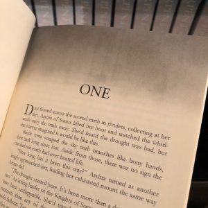
I’m not sure how well it worked, honestly–black and white print doesn’t offer the most stunning quality, so it’s kinda hard to tell it’s supposed to be dust. It sort of just looks like a gray gradient. If I were doing this one over, I’d draw a scraggly dead tree on a sandy hill instead.
The Keeper’s Kin books are sorta-related in how I styled the headers. Keeper’s Finder mostly deals with red tape and office politics, so a modern fountain pen became the signature header of the Keepers.
The Keepers get a few chapters in some of the other books in the series, so the pen is used there, too. But for Her Midnight Cowboy and the rest of Kade and Felicity’s books, we have…
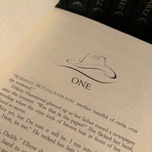
…a cowboy hat, representative of Kade. I mean, how could I not? The First Hunt uses bullets, but that book was released as digital only, so I don’t have a photo of it to share.
Then we’re back to Fantasy with the Snakesblood Saga books.
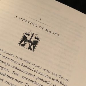
A lot of thought went into these. Some are obvious choices, others less so. Serpent’s Mark features the seven-pointed star of Ilmenhith, since getting there is really the primary goal of the story:
The fact we also spend the book learning about secrets hidden by the royal family (who use the star as their crest) is just a nice bonus. Or maybe a little intentional. 😉
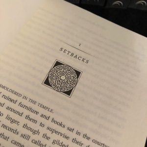
But most of Serpent’s Tears happens inside the ruins, so using a circular maze to represent the ruins was an obvious choice. I don’t want to talk about how long it took me to get that vector image right, though. Did I mention I drew these? I don’t think I did. The only exception is Kade’s hat, which was a stock image I bought and then altered. Everything else, I drew on my own.
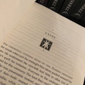
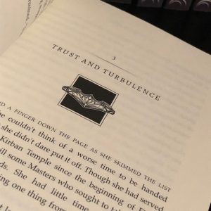
Serpent’s Bane was where we saw the first split. As time went on, I found it was harder to represent the ongoing story with just one symbol, so I decided to provide one for each faction that had a story of its own going. Rune got his rock. Firal got her rock too, but hers is a necklace, so she’d probably be annoyed that I called it a rock. But the similarity between the two shapes let me keep some sense of unity between the two symbols, which I enjoyed.

Notice how they’re also pointing different directions? Those little things are a lot of fun to put in, but I’m not sure if anyone ever picks up on them!
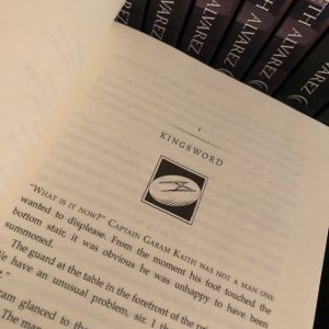
Book 4, Serpent’s Wake, saw the introduction of what’s probably my favorite icon of all: the Kingsword. But again, there were other icons for this one. Less unity in these, beyond that they represent what had consumed each character’s life.
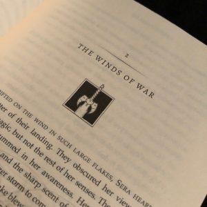
Rune got the sword…
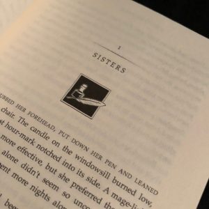
The temple mages got a pen and ink…
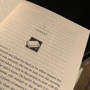
And Firal got a book and her pendant, the significance of which is buried in the story itself. So after the factions split up like that, it was kind of a jump to go back to one icon for book five. But for obvious reasons, a crown was the best possible choice for Serpent’s Crown.
I’d actually really like to make that crown design for my dolls of these characters, but when would I have time? Maybe someday.
Book six also only really needed one symbol, and it’s another favorite. Serpent’s Blood features the merging of Rune’s Kingsword with the crest of Ilmenhith’s royal family. I think that kinda speaks for itself, and is probably the strongest symbol I could have chosen for the last book in the series.
It was an interesting design exercise, too. The first time I depicted the Kingsword, I’d been torn about whether it should show the hilt in black or white, since it’s black in the books. But it ended up being hard to see against the black background. I was delighted when I realized needing to add contrast against the backdrop of the white star meant I’d get to show the Kingsword in black to help it stand out. And also make it more interesting than just pasting the two images over the top of each other.
There’s two more books to look at. The symbol in the Westkings Heist series is the same through all 3 books. The mark of the Ghost appears at the top of every chapter in To Steal the World, To Steal the Crown, and To Steal the Queen. I think I’ve discussed this one a little on my blog before. My husband was the one who whipped up the design for me, something simple but striking, representing an eye glancing out from a hood.
And then that just leaves the newest series, Spectrum Legacy, and the icon I decided to use for the chapter headers in Spectrum Blade. All the major magic artifacts make an appearance in book one, but the only arc the book solidly resolves is the arc for Kolmar, so the forest’s artifact got the privilege of being the header for chapters throughout the whole book.

I touched up the gouache painting I’d done of the Hymnflute and opted to use that for the graphic. I’ll incorporate the other two artifacts in books two and three, and then there will be some surprises in place for the rest of the series.
Right now, that’s all of them. You know which ones are my favorites, but which designs do you like the best?